When I first purchased my Cricut, I was using it for scrapbooking. Do you still scrapbook? I am a few years behind on my books, but life got busy and I also wanted to try other crafts. Here is a scrapbook layout from when we went to see Kelly Clarkson at the Mall of America.
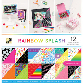
I used the Rainbow Splash stack from DCWV, which has an amazing collection of bright colors and patterns. I like how this paper is double sided, so you get even more colors and patterns to work with.
The first thing I did when designing this scrapbook layout was to go into Design Space and make a 12 x 12 square, that a made a dark gray color, to represent the black polka dot patterned paper that I knew that I wanted to use for the background of this scrapbook layout.
Then I started to add in the other elements. I made squares and rectangles to represent the photos for the layout so that I could play around with the placement of things.
One thing I love about my Cricut is that I can have an idea in my head, and make it a reality with the functions and tools in Design Space. For example, I knew that I wanted a header that had a line from a Kelly Clarkson song.
Since I didn't want to glue all of those letters down one at a time, I decided to use a writing font, and have the Cricut write the words "what doesn't kill you makes you" with a pen on some white cardstock. You can click HERE to see my tutorial on how to choose a writing style font.
Since I did not want my Cricut to actually cut the elements that I put in this layout to represent the background image or the actual pictures, I use the little eyeball icon on the layers panel on the right hand side to turn off the things I did not want the Cricut to cut. Just click on that eye to turn elements on and off, and then it will look like the image below. Now I can hit Make It.
I wanted to show you a close up of one of the elements I added to this layout. I use my Zig glue pen to apply the glue to the back of all of those little details for the swirls behind the star. I love that I can get exact placement of the glue with the Zig pen.
Another thing that I wanted to show you with these close up images is that the papers from DCWV that I used have patterns on them. This layout used four different patterned papers in it, but they all combine and work together so well because they all came from the same Rainbow Splash paper pack. The black has polka dots, the white has bright colored lines, the yellow has words in white and the green has a a pattern in a different shade of green. That is one thing I really love about using DCWV paper. The various papers from the same stack will coordinate together perfectly.
Did you notice how I layered the colors for the word stronger? I think that it helped to make that part of the layout really stand out. To do this, I used a multi layered font from Cricut, so that it was already set up to do that perfect shadow behind the letters. Click HERE to see a tutorial about how to find a multi layered font in Design Space.
I think that the bright colors really pop nice off of the background.
If you like this layout and want to make it for one of your scrapbooks, here is the link to the link to the actual project in Cricut Design Space . . . click HERE and then save it to your projects.
Keep following me and join my Teach Me Cricut Design Space group on Facebook!
Thanks!
Shawn's Teach me Cricut Design Space Group
Crafty Chic's Blog on Facebook // YouTube // Instagram // Crafting Pixie


As reported by Stanford Medical, It's in fact the one and ONLY reason women in this country get to live 10 years more and weigh an average of 42 pounds less than us.
ReplyDelete(And by the way, it has totally NOTHING to do with genetics or some secret exercise and really, EVERYTHING about "HOW" they are eating.)
P.S, What I said is "HOW", and not "what"...
Click this link to reveal if this short test can help you release your true weight loss possibilities